When designing a logo, one of the the most important parts to consider is the shape that is used. Of course, you have to think about this to some extent because shapes are necessary for things to exist; what we mean here is that the shape(s) used in the logo design process need to be considered carefully and carry meaning.
There are few things more relevant than shape. The brain is programmed to remember shapes. Think of some logos and the shapes that they are. Chances are, you remember the logos of things you see often but even the logos you may not see for stretches at a time are in your mind. Why? Because of the shape.
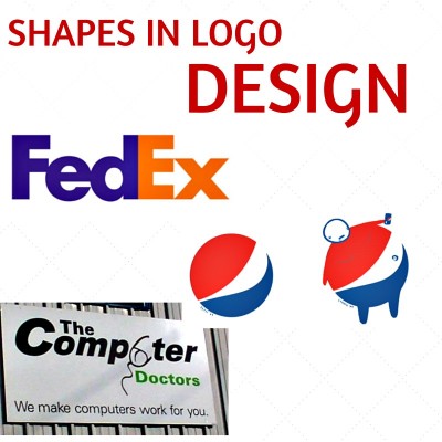
When a logo is being designed, a lot of considering needs to be put into shape and meaning needs to be added to it. Look at the FedEx logo and how it utilizes the shapes of the letters. The negative space between the E and X creates an arrow pointing forward. The arrow communicates speed and precession, two things FedEx believes in.
Now, take a look at the new Pepsi logo. For many people, this logo was just “meh”. But for a professional graphic designer, this logo looks like other things, such as a fat man with his belly showing. Pepsi paid $1 million for this logo and it gets made fun of (not as bad as Airbnb’s logo but that’s another issue).
Lastly, look at The Computer Doctors’ logo. Yeah, you probably see it. If you don’t, look at the “mouse” in the word “computer”. Now you see it? Okay, let’s move on. Clearly, the designer here did not consider shapes. Nor their meanings. Failing to do this results in misinterpretation a lot of the time.
Don’t hire a graphic designer who doesn’t consider perhaps the most important part of logo design, hire Integraphix to design your next logo and get a logo that is meaningful, effective, and memorable.
Tags: chicago graphic design, chicago logo design, LA logo design, logo design basics, logo design tips, los angeles graphic design, new york graphic design, New York logo design, shape in logo design

