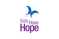
Integraphix was asked to re-envision the logo design and brand identity of Kids Have Hope, a 503c Organization in the Chicago area dedicated to educating children and adults about child abuse prevention. Their original logo (see below) was dated and didn’t have the impact or memorability of their fellow not for profit organizations.

Integraphix took the original butterfly concept, which the client wanted to keep, and integrated it with the organization’s very purpose: children. The new logo design and brand identity, makes use of the negative space to incorporate the outline of childrens’ faces to create the wings of the butterfly. The colors were updated as well to lift the brand out of the land of primary colors and into a more modern, sophisticated yet still relevant palette.

