As Chicago graphic designers, we love creating logos. Logo designs are one of the most important branding features a company has. Logos must accurately represent who your company is and ultimately if it’s one well, it should become your company’s identifier. A big part of your business’s identity is wrapped up in your logo.
Here at Integraphix, we always say you never get a second chance at a first impression. Simply put, your logo needs to reflect your business and elevate your brand upon first glance. Your logo needs to stand the test of time, with perhaps only some minor changes that will be made. Here are some classic logos that have changed over time.
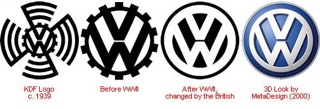
Volkswagen:
Starting out as a project of Adolf Hitler’s, Volkswagen’s original logo featured Nazi elements, which were removed after the company was seized by the British. Over time, the logo has stayed relatively similar, but minor changes have made quite the impact.
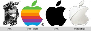
Apple:
As Chicago graphic designers and logo creators, we know how far a simple logo can take you and apparently, that’s not what Apple was thinking with their first logo. Yes, Apple’s very first logo was pretty complicated. But over time, with minor changes, they have definitely got it right.
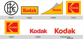
Kodak:
Kodak’s original logo integrates the company initials into the logo design and they were one of the first companies to do it, so kudos on the originality. The box, red and yellow combination and curled corner are gone leaving the name to stand alone and with brand recognition they can pull it off.
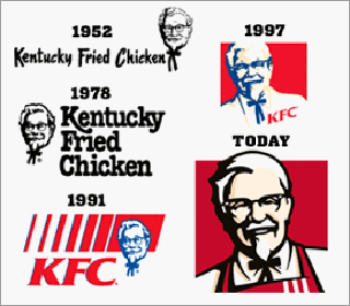
KFC:
The Colonel himself has always been apart of the KFC logo, but even his look has changed over the years with logo updates. Today’s logo drops the company’s name, a bold branding move by KFC.
BMW:
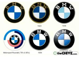
Even popular luxury brand BMW has made a few small changes to its logo and over time it has become quite distinguished and refined. BMW’s logo is a good example of how a good logo can stand the test of time, there’s certainly did.
Pepsi:
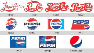
Pepsi’s logo has gone through quite a few changes over the years, and most surprisingly, there is no trace of the old logo in the new logo. While that is not common, we feel it worked out well for them.
Starbucks:
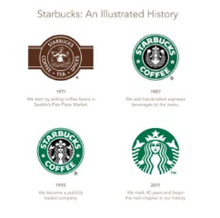 Starbucks’ logo has become more likeable over a few changes, but it’s most recent change in 2011 was the removal of the signature font and company name. It’s a bold move, but for a brand that is as large as Starbucks is, they can pull it off.
Shell:
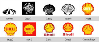
Shell’s logo has come a long way from its very first design to its most recent. They are still sticking with the red and yellow colors as always, but have achieved enough brand recognition that they have dropped their name from the logo.
A logo is a major branding feature and is one of the most important pieces of the brand building process. At Integraphix, we strive to create logos that are creative, memorable and classic to stand the test of time. Logo comments and questions are always welcome.

