As graphic designers, we like to take every opportunity available to think outside the box especially when it comes to designing logos for clients. Like most graphic designers, we like to believe in the strength behind hidden messages within logo designs. When it comes to the graphic design process, there are many different strategies to take when you are given new projects or come across a unique challenge.
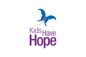
As described in a previous blog post of ours, The Positive Side of Negative Space, negative space is always a great design technique. Integraphix designed a logo for a non-profit client, Kids Have Hope. At first glance viewers obviously can see the logo as a butterfly, but look a little closer. Are you able to see any other images? Our graphic designers used the power of negative space to create two faces within the butterfly’s wings. Can you see it now?
There are many corporate companies that also use the technique of negative space.
At first glance the FedEx Corporation appears to have a very basic and legible logo, but have you ever noticed the arrow between the letters E and X? The arrow is used to represent and symbolize the company’s speed and efficiency. The FedEx logo design team utilized the negative space between the letters to create a subliminal message.
 The Toblerone logo looks like a simple mountain, but if you look closely at the negative space within the mountain, you will notice a silhouette of a bear. Not only is this a creative addition to the design, it is also meant to symbolize the city of Bern in Switzerland.
 The logo designers who created the non-profit Hope for African Children Initiative logo design also used negative space as a part of their design concept. The logo is a design of a child and an adult facing each other. Between the two people, the negative white space is the shape of a hand-drawn map of Africa.
 The NBC logo is one of the most popular, well-known television channel logo designs. While most of us know that the logo is meant to be a peacock, it goes to show how negative space can really make up a logo design. If you look in the middle of the colors, you will notice the negative white space and in that white space you can clearly see that the colorful parts make up the peacock.


