As designers in Chicago we spend a lot of time analyzing the logos that we come across. While there are a multitude of ways to ruin a logo, our graphic designers all say that one of the most common mistakes they come across when it comes to logo design is choosing the wrong font. The easiest way to recognize a company is by the logo, which is why your logo design is essential to your branding and business. When it comes to creating a logo, choosing the right font can make or break your logo design. Finding the perfect font for your design can be very time consuming, but once you have selected that perfect font it is very rewarding. Designing logos is a process and every step of the way is essential. In the process of creating a logo, our logo designers can spend hours going through font libraries just to find the perfect fit.
Have you ever noticed a logo that consists of more than one font? Not only can a logo design go from good to bad just by a poor choice of font, but using multiple fonts is a big no no. As a logo designer, the main goal is to create a unified, unique, simple image for the company. For example, if you are a company like Chanel known for being a luxury brand, using a font like Comic Sans may make your brand look just the opposite of luxury. The purpose of a logo is to be easily recognized and remembered by viewers. You’re font choice should never be distracting to your design. In order to create an effective logo design, your font choice should balance with the overall design.
When it comes to font choice and logo designs, many people probably do not realize the significance. If you are a graphic designer creating a logo, this is not the appropriate project to break out your old standby font that you use for 90% of your projects. It’s a decision that you need to thoroughly plan out. Whether you’re a lover or a hater of the font Comic Sans, you’ll definitely get a kick out of these logos our designers in Chicago found. Comic sans is often a very controversial font with very mixed opinions on it. The font was designed in the 90’s with the intent to be used in comic books. Despite its original purpose, the font is definitely overused and often times we have found that it is used at rather inappropriate times. Below is a list of well-known logos in Comic Sans font. Would you give these companies your business? Think of the way the original logo looks with its standard font and compare it with these images. Font choice makes a big difference doesn’t it?
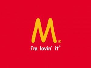
McDonald’s– Are you “loving it?”
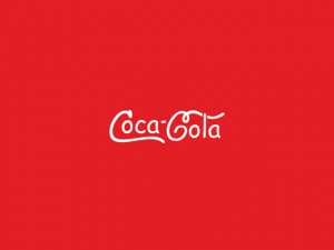
Coca-Cola– What do you think? Does it still look classic?
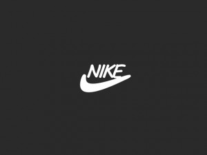
Nike– Does this one “just do it” for you? It has as completely different feel now as opposed to the real version of the logo.
Chanel– The font change takes the logo far away from the classic look we all typically associate with brand Chanel. Ah the power of font!
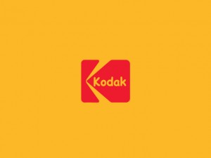
Kodak– Kodak is a timeless brand with a great logo, but what a difference font makes.
Microsoft– The font change makes the logo design appear child-like rather than tech-savvy.
 Disney– Another timeless brand and logo appearing quite different with the font change.
YouTube– The original logo design is transformed by the font change.
Android– Another big logo design difference!


