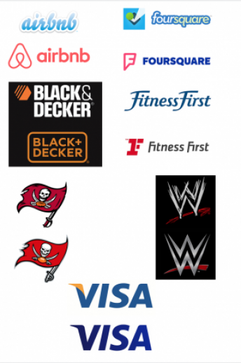
Brands redesign their logos all the time. It is necessary to stay current with the times, to move away from a bad image, to establish a brand identity, etc. Of the many rebranding attempts of 2014 via logo redesigns, here are some of the best and worst that we have seen.
Airbnb– This should come as no surprise that this is arguably the worst logo redesign of 2014. In theory, it is not ugly, just poorly thought out and executed. Airbnb is one of the fastest growing companies right now and have been gaining popularity in major cities. The new logo apparently resembles a female body part. They invested a lot of money into the redesign.
Foursquare– In addition to the logo redesign, Foursquare completely changed its app and how it functions. One of the most popular options for users was “checking in” at their locations; now that is a separate app than Foursquare. They ditched the iconic blue square with white checkmark & green dot. They opted for a much more generic “F” and new color scheme.
Black + Decker. Formerly “Black & Decker” made its way through a redesign in 2014. They ditched the “hardware store” vibe in favor of a cleaner, more modern typeface and design. The swap of the ampersand for the plus sign is nice but our logo design team does wish they’d have kept the iconic, orange hexagon.
Visa. They updated their logo and their tagline. In the past, their tagline was, “For everyone, everywhere.” and now it is, “It’s everywhere you want to be”. They updated their logo by removing the yellow fin on the V and changed the blue to a darker shade. As a professional graphic designer at a design firm, I wish they’d have kept the yellow fin, it was iconic.
Fitness First. This fitness club definitely needed a new logo. Their old one was much more feminine, which meant men were less likely to sign up for a gym membership there. It was also much more generic. Their new logo is blockier, trendier, and gives a tougher feel, which is great for a gym. The red “F” resembles a UFC type look, which furthers that “tough” vibe.
WWE. The renown wrestling franchise started out as WWF released a new logo this year. They replaced the scratchy, 1980s logo with a modern, steel look. Some say this logo is not contemporary but the thing about logos is that they are supposed to just look good, not fly with fads, or they need to be redesigned in a couple years (that’s not good). It looks sleek and fitting with the feel of the action.
The Tampa Bay Buccaneers. The team revamped things this season with a rebranding. The team went with a “bolder” look with their uniforms and their logo. They smoothed out the edges, made the flag brighter, and made the logo much larger on the team helmets. Let’s not forget the much different uniforms the team has this season.
Does your business feel it is time to rebrand and get a logo redesign? Then talk with Integraphix, we are a creative marketing agency with a top-of-the-line graphic design team.
Tags: airbnb, best and worst logo redesigns 2014, black + decker, chicago graphic design, foursquare, los angeles graphic design, new york graphic design, tampa bay buccaneers, visa, WWE

