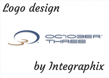
The logo design for October 3, an actuarial firm, is one of the most delicate and interesting designs we’ve done at our Chicago graphic design agency.
When people hear their company name, many do not know what they do, at least not without a hint. The logo design & branding process for O3 started in an interesting fashion. The client did not want to look like they were part of the industry, which sounds backwards, right? In fact, the firm’s name itself sounds a little strange; however, the name indeed makes sense since it is the date that the founder’s non-compete contract ended.
The logo design can be interpreted in three different ways:
- Enforcing the digit 3 a second time
- In the O3 in the logo mark
- Incorporating the 10 and 3 in the “October”.
Tags: actuarial firm logo design, chicago graphic design, chicago graphic design agency, chicago graphic design firm, chicago logo design, october three, professional graphic designer

