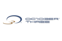
October 3 is the most enigmatic logo design we’ve ever taken on. Guessing what this firm actually does would be next to impossible without a hint. The logo design and branding experience began the oddest of ways; with the client asking to not look like they were apart of their industry. October Three is an Actuarial Firm with the name being derived from the date the owner’s non-compete contract was no longer active.
The logo design itself can be read three different ways, enforcing the number 3 once again: in the O3 of the logo mark, in ‘October Three’ of the lettering, and within the typography ’10 3′. The logo design is modern, fun and totally removed from what a typical Actuarial firm brands themselves as, but this isn’t your typical firm so the design fits the company culture.